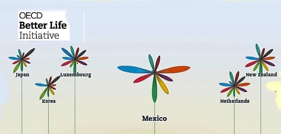
An interactive graph from the OECD (Organisation for Economic Co-operation and Development) now allows you to compile your own “Better Life Index” and compare “well-being” across the 34 member countries of the OECD. From an educational perspective, the graph offers hours of fun and fact-filled learning opportunities.
The graph allows you to set individual weightings for each of 11 variables considered by the OECD to be important for well-being, and then see how the 34 countries rank on a graph. The graphs can be arranged either by rank or by country name. The 11 variables are:
- housing
- income
- jobs
- community
- education
- environment
- governance
- health
- life satisfaction
- safety
- work-life balance
The symbols for each country are a flowers with 11 petals, one for each variable, where the length of the petal represents that country’s score and the width of the petal reflects the weighting you’ve given it.
This would be a great starting point for discussions of what “well-being” really means, and why different people (different countries?) would choose very different weightings for the 11 variables.
- Further details of the Better Life Index data
- Key findings for Mexico
Related posts:
- How did Mexico rank on the 2010 Legatum Prosperity Index?
- Inequality in wealth in Mexico: the GINI index
- Females, males and gender inequality in Mexico
Various simple and compound development indices are discussed in chapters 29 and 30 of Geo-Mexico: the geography and dynamics of modern Mexico. Ask your local library to purchase a copy today!

Sorry, the comment form is closed at this time.